Design Elements & Principles
There are two categories of ideas that help guide a design project into being, and help to ensure that it looks good. This post is for those of you that have no idea where to start when it comes to remodeling, redesigning, or just re-arranging a room. They are textbook ideas, that can be broken of course in tasteful ways, but that help tremendously in guiding design choices. In design school, this was somewhat of a hard concept to grasp, but eventually with practice (if not immediately) you start to wrap your head around it. Design Elements: Simply put, design elements are just that, the elements, or pieces of a design project that need to be put together in certain ways to make the space work.
1. Line: The concept of the line as a design element (in interior design) can be described as the connection between two points which can be used and interpreted in so many ways. The line, whether physical or implied, can be straight, curved, or wavy, and can be used as a divider, (like between two wall colors) an edge, an implied negative space distinction between one thing and another, etc. The range of examples could be from a line on a pillow, to a tall column, to a fireplace shelf, and so on. The length, width, and direction of the line should be considered when designing. Vertical lines suggest grandeur, exaggerated height, and positivity. Horizontal lines could suggest stability, relaxation, coziness, or boredom. This is why the element of 'line' should be carefully considered for the look and feel you want for your space or for your client. Diagonal lines suggest dynamism, change, and unpredictability within a space. (Would you want to use this in a schizophrenic's bedroom?) Other types of lines bring different elements into a space, they just require common sense. In the photo below, both rhythm and pattern are created with the lines on the wall paneling.
2. Color: We wouldn't be able to design the amazing spaces that we want to without the element of color. There's so much to say about color, but I'll give you the shortest version I can, what I believe is most important to know, and you can research the rest. Choice of color goes way beyond what is "pretty" or "nice" or "cool". Color influences our minds, our moods, appetites, energy level, happiness. I read multiple scientific journals in school about how certain colors made people angry or hungry when exposed for long periods of time (red), or how a color helped calm people down during stressful situations (green), and what colors were most likely to increase depression (blue and grey). These are not proven facts, nor should we stray completely from colors we like because of these studies. My point is, there are more things to take into consideration and help you make a decision when it comes to color, especially if the design is for other people and they have specific problems or needs. The color of your environment is what makes it feel like home, energizes you, motivates you. So choose wisely, and take risks. Think outside of the box, for this is what enlivens a space. The other side of color choice is which colors go with which. This is where you research primary, secondary, tertiary, and other color schemes to see what colors play well together, what schemes give off what vibe, etc. which subject I'll be sure to do a post on. (For example, kids tend to love primary colors (red, blue, yellow) because they're playful, straightforward, and bright.) As far as principle goes, color can create drama, contrast, influence focus, balance, unity, harmony...heck, it can control how all of these principles succeed, no pressure! ;)
3. Shape: Shapes are two-dimensional areas that are formed by their boundaries and stand out because of what value, shade, or texture they're next to. Shapes in interior design can be geometrical or organic. Geometric shapes are how they sound...squares, triangles, circles..mathematically understood. Organic shapes are more unpredictable, nature-like, and have a very different appeal than geometric shapes. For a long time, geometric shapes were the 'modern' choice when it came to design details like wallpaper, furniture, artwork, and architecture. But times have changed, and organic shapes are just as modern, hip and up-to-date to the design world as twitter is to social networking. (Squared-off architecture is still beautiful and hasn't dated, but check out some of the dome, treehouse, and cave-like homes that are rising to popularity!) Anyway, shapes can be used to create our principles of pattern, rhythm, focal points, and so on below.

4. Texture: Texture is what gives our rooms variety. How boring would a living room be if everything was made of the same material? Generally there's a suede sofa, leather recliner, some velvet throw pillows, you get the idea. But it's more than material, it's the specific visual and tangible essence that makes it a texture that matters. The textures that contribute to the whole design and would even stand out if you were to snap a photo and show it to someone. In my personal opinion, appealing texture is what most designs lack. At some place somewhere at some time in the past someone said, "Everything needs to look pristine, all polished and new, no more scratches, exposed substances, all comfort." I would like to have a word with this person. It was probably sometime during the Victorian era and after the industrial revolution, once things became cheap and easy to make - no more hand-made craftsmanship. Well times have changed in the design world, and I'm so glad. Top designers are using old rice bags for accent pillows, concrete and raw wood everywhere, old rusty lanterns for primary accents. It's all about the texture. An antique revolution has began and it's the character that the 'used look' provides, not to mention an awesome one-of-a-kind story behind each object. But it's still hard to know when and where these materials are appropriate, when they'll look good, and whether or not you can get used to it. And sometimes, it's just not your style. Either way, texture is a very important aspect of good design, whether it is a rusty accent chair, or shimmery backsplash glass, textured wallcovering, rustic stone accent wall, or just a faux-finished ceiling. (Interesting fabric textures include hemp, jute, silk [look into peace silk], canvas, & burlap.)

5. Space: Space is just that, space that is used or not used. Positive space is space that is being used, negative space is not. Interior designers should be concerned with space in effort to avoid clutter, and offer enough room for traffic. This is why there's a whole step called 'space planning' that deals with where things will go, and where the negative space will be. There should be clear traffic pattern areas and usually the more open space, the better. Even the tiniest room with tons of things can be arranged in a way where traffic is not a huge issue, and where reasonable organization can occur. But not only does the element of space deal with physical space, it also deals with wall space, table space, etc. As you'll read below, balance is a very important principle of design, and (positive and negative) space plays a big role in that. If you have a certain amount of space on either side of a door, you can balance it with positive and negative space, i.e. two small plants and one big plant. Space also plays a big role in proportion and scale. Example: a hanging photo should have a certain proportion to the wall so that the resulting look isn't awkward, the photo should have a certain amount of space around it. Likewise, if you have a huge blank wall space that you want to use for that perfect wallcovering or bright paint color, the scale of that covering's space will result in excitement, drama, focal point, etc.


6. Form: Forms are just three-dimensional shapes. They can be measured length, width, and height. Like shapes, there are also generic forms (man-made) and organic forms. A man-made form may be a concrete statue, and an organic form is a house plant. Think of how the forms in your house interact with the space and shapes in your home and just remember to organize them in a way that ideally follows a principle below. Maybe your forms could be accents, focal points, create balance, etc.

Design Principles: Design principles are how the design elements are put into practice. It is how you use the elements that determines how well you followed the principles.
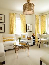
1. Unity: Unity is when certain elements agree or have similarities with one another. Some are the same color, some the same texture, same shape, etc. It's a good idea to have multiple elements that are in unison, and some that aren't. This creates variety. In order to spare you more reading, variety is just the opposite of unity. It is when there is an interesting inclusion of different objects or elements to create excitement and..well...interest! In this left photo, unity is created with the yellow main accents, rattan textures, neutral furnishings and walls, and black small accents. On the right, the variety is seen in the different styles of furniture and accents. A traditional antique chair with modern velvet and steel stools, a plain deep blue couch, with a green lamp and tortoise shell wall art? Variety? I think so.
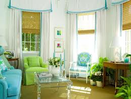
2. Harmony: Harmony is a very general term to describe when the elements of a design all work together to create a balanced, unified composition in which all elements are in their right place, working together, and the design is considered whole, instead of just a bunch of parts. Nothing is jumping out of the design uncomfortably whispering (or annoyingly screaming) "I don't belong here" or "something's just not right here." Harmony is achieved when all colors are working together, rhythm is doing it's assigned job, balance is created, and the viewer feels like all elements are working together in unison. Is there anything you could say about the following photos that would be in disagreement about their harmonious nature? All elements are applied in a tasteful way to create principles that work in unity with one another. Whether it's the color scheme, the way the designers applied both unity and variety, or the rhythm and pattern that creates movement in the room, I believe these to be great examples of harmonious designs.
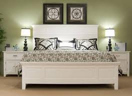
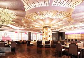
3. Balance: In a well designed space, a type of equilibrium is ideally achieved, this is called visual balance. Balance helps create unity and harmony. You wouldn't want things just strewn across the room, randomly placed, or the room would appear chaotic and out of order. A sense of balance is calming, and there are tons of ways to create that balance from a large scale to a small scale. The main ways to create balance is utilizing 1) Symmetry- creating a mirror image on either side of a central line, 2)Asymmetry- creating symmetry by utilizing multiple small objects on one side and one large object on the other side of a common divider...you get the idea. The third type of balance is 3) radial balance. Radial balance is circular organization around a center point, items organized or radiating out from a central spot in space. An example of a symmetrically designed floor plan would be a square or rectangle, an asymmetrical plan could be something with a mix of a triangular shape and some other shape, and an example of a radial home plan would be an igloo, tee-pee, or dome. If you cut the bedroom picture through the center vertically, there wouldn't be much difference on either side. The other photo is of a building's ceiling utilizing the principle of radial balance, stemming from the central post.
4. Focal Point: A focal point should be the most interesting, first seen, perhaps largest thing in the room. It's what will attract the viewers eye and relieve the room of boredom. This usually is seen in the form of a fireplace, massive colorful painting, flat screen TV & entertainment center, etc. but it can be so much more. You can use colors to create contrast or surprise for the focal point, scale to attract the eye to something larger than life, and so on. In this bottom left picture, the unique painted back wall is this room's obvious focal point, and there's nothing else competing for it's glory. On the right, the red chandelier utilizes color and scale to win the title of focal point.

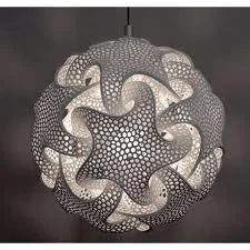
5. Rhythm/Pattern: Rhythm is the principle of things basically "flowing" well together in a certain way. Harmonious color schemes can create rhythm within a space by causing your eyes to move or flow easily from color to color. A few pieces of furniture with similar but different shapes can create rhythm, etc. The design element 'line' also contributes to these design principles tremendously. Pattern is achieved with the principle of repeating elements. It's something that happens over and over again. Just like the repetition of vertical and horizontal lines on a pillow, or a certain motif happening over and over in a room. (This can create unity. Note: Multiple principles can be achieved from the same combination of elements.) Top: the rhythm is in the repeating ceiling detail. Bottom left: pattern is created by using a mesh with repeating triangular shapes. Bottom right: Rhythm is created by repetition of undulating curved wood pieces organized like so.


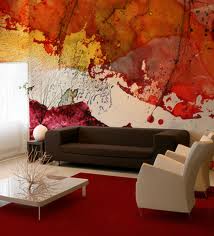
6. Contrast- Contrast can be described as the opposite of similarity. It is when two elements, usually color, are very different from each other, not always opposite. Not to say that contrast and similarity (unity) can't exist together, they very well should, but in a tasteful, harmonious manner. There should be some contrast in a design to create excitement and diversity. That is why black and white exist very well together in design, because they are the ultimate contrasting colors and it creates a jolt of excitement. You can use any design element to create contrast - different lines, contrasting shape, as long as you are careful to implement this principle into the unity of the whole design. Top: This is a great example of an entire room utilizing the principle of contrast with the elements of color. Bottom: This is a good example of a room utilizing (black and white) color contrast that blends in as one principle in addition to other principles that make up the entire composition.
7. Scale & Proportion: These two principles are put in the same category because they both deal with the size of things, but they are different and can be extremely confusing. Scale deals with the size of an object, or a few objects up against the rest, that are of a massively different size. Usually the object is much larger than the things around it, and this is to create focal points or implement drama into a space. It attracts attention and causes surprise. So scale can be described as the size of one thing compared to the things around it. Proportion deals with the size of multiple things up against other things, or one thing to another, and how they relate to each other. Example: That door isn't proportionate to that wall because it is too big for the wall. Or, his head is not proportionate to his body. It is comparing two or more things to each other, that would or should be normally relative to one another in a certain way.
See how the planters in the left picture and the lamp on the right have a massive scale in the room? See the awesome drama it creates? In addition, see how the things in the back of the left photo are in proportion to one another?
Left: 2007-2011 © GAILE GUEVARA
8. Hierarchy- Hierarchy deals with the way things are arranged in order of importance. You wouldn't want to walk into a room and see a huge photo of your dog right off the bat with an original Van Gogh painting off somewhere in the corner. You wouldn't want more emphasis on an old bookcase than on your beautiful 1950's brick fireplace. You want to create a sort of design story within your space with things organized in terms of significance, gradual enticement, or whatever your design concept demands. Basically, you do not want the design elements of your space competing for attention. You want the viewer's eye to travel from place to place slowly, taking in one beautiful part at a time, yet seeing the design as a complete whole. You do not want the eyes flinging from object to wall to corner wondering what's going on and what's so important or special. It's hard to pinpoint every specific part of the room the designer wants the viewer to notice in order, in it's entirety. But you most definitely should be able to know where to look first (focal point), and notice the secondary, tertiary, and accent elements.
As with the photos below, top: you most definitely should notice that the reception desk is the most important element, and that the designer completed it with yellow back-lit panels and under cabinet lighting to designate it as so. Then you begin to notice the beautiful stone on the walls behind, and the row of floor to ceiling windows in the back. Bottom: (MTV Headquarters in Germany) the focal point is the lime green couch, because of the bright color in the midst of neutrals and it's central placement. Then you notice huge undulating white planes formed into leaf-like structures, because of their scale, then the wood laminate tables dispersed on the sides.
[cpDonation id='donatetovivendidesign']